Designing NeedyDelivery
Designing NeedyDelivery
“The more efficient way to provide food to those in need. Sign up as a driver or request food from those in your community.” -By Levi Schubkegel
From the start, our goal with Needy Delivery was to re-skin an Uber Eats like project, modify it a bit, and get it out the door, FAST! With Thanksgiving fast approaching and the giving season to follow shortly after, we knew we wanted to get this product shipped and iterate after the fact.
As a volunteer UX Designer at Comida for Familias , I created this design, using Uber Eats as a basis of design.
The Design Process
Empathize: Competitive Analyses and User Research
A previous UX Designer performed the primary user research and competitive analyses on this project. What they gathered was a list of already existing applications that had different methods of solving the hunger problem. For example:
- Matching Donors With Recipients
- Trucking Against Hunger
- Individual Donations
- Even Saving Food From The Bin
The result of their design was submitted to the Developer Week Global 2020 Hackathon .
Although the design was submitted, the app was still incomplete. Thus, I was brought on in the Ideate phase and started contributing to creating a prototype.
Define: Problem Statement & Objective
Too many people go hungry in a world of excess food. Hungry people need a way to connect with those who want to help others by donating food. With Needy Delivery, we will connect these two groups of people, the givers and receivers, so people can share with those in their communities to reduce the number of people who go hungry every day.
To design an app that connects hungry people and those who want to share with a simple to use app that help them build and take care of their local community.
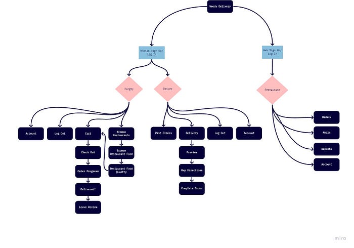
Ideate: Information Architecture
Starting with the screens provided in the project tutorial, I made a site map and modified it to suit our needs. Don’t recreate the wheel, right? The differences with our app (initially) was that there wouldn’t be a payment screen, everything would be free. This then evolved into donations for payments instead of set prices.
As you’ll see, there are two primary flows to the mobile portion, a driver(donator) and receiver. There is also a web portion of the website to include any organizations, institutions, or restaurants that would want to offer set foods to those in need.
Prototype
When creating prototypes, I divide the process into 3 steps:
- Wireframes - black and white layout to figure out where all of the components will go
- Low-Fidelity Prototype - figure out the information and functionality for each component. This is before adding color or getting too caught up in aesthetics.
- High-Fidelity Prototype - adding personality to the design. This is what the final user interface should look like.
**Wireframes:**Using the previous information about what pages should be included in our information architecture, I created some mock ups of some of the screens within the sitemap.
The images below are some quick mockups done with Balsamiq. It is really useful to get ideas quickly blocked out on scaled screens in order to get feedback and make sure that it has all the necessary components. As you get into higher fidelities, it is easier to overlook the functionality due to the appeal of the layout and components themselves. Keeping it black and white and sketchy is the best way to ensure you have all the necessary components before moving forward.
**Low-Fidelity Prototype:**After mocking up the screens and figuring out what they might contain, I began to sketch out some ideas in Balsamiq of what the screens within the information architecture might look like. This is in line with staying at a low fidelity while figuring out what components are needed on each screen so as to not be distracted by aesthetics. This also saves time and money in the grand scheme of things.
I then used Balsamiq’s prototyping feature to create an initial low-fi prototype of the design.
Figma Prototype
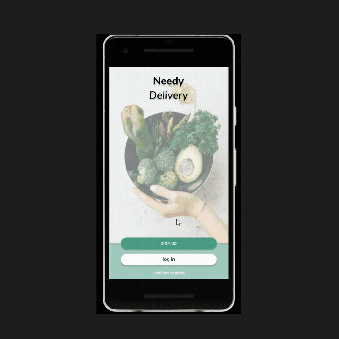
**High-Fidelity Prototype:**Using Figma, I further refined the design, adding common Google UI elements and giving the prototype more personality and a common design language. This also allowed me to explore the brand even more and incorporate that into the design. The brand is fun and friendly to all. I tried to follow Google Material Design guidelines which helped keep everything minimal and easy to explore. This follows Jakob’s Law of Internet UX which states that users are familiar with the apps and services that they use every day and expect other apps and services to behave in a similar manner.
Test: Usability Testing
We performed a variety of tests, one of which being a preference study, studying which home screen users preferred. We had two options to choose from, a screen with two buttons or a screen with a slider and one button as seen below.
The results were inconclusive, too close to tell a difference. In the end, we went with the design that was easier for the developers, the slider option.
App Launch & Review
In the later stages of prototyping, I was able to get some of my fellow classmates to review the design which really helped refine the design and turn it into the design it is today. They also found different errors of my app within the prototyping software that were crucial to resolve before presenting it. Another big aspect of the app that was introduced only after peer review was an on boarding process which users ended up loving.
Find Needy Delivery on:Google Play Apple App Store
Any feedback is appreciated.
CC BY-NC 4.0 2025 © Dimitri POSTOLOV.RSS